“The way it blocks out non-relevant colors so you can actually see the combination is genius.”
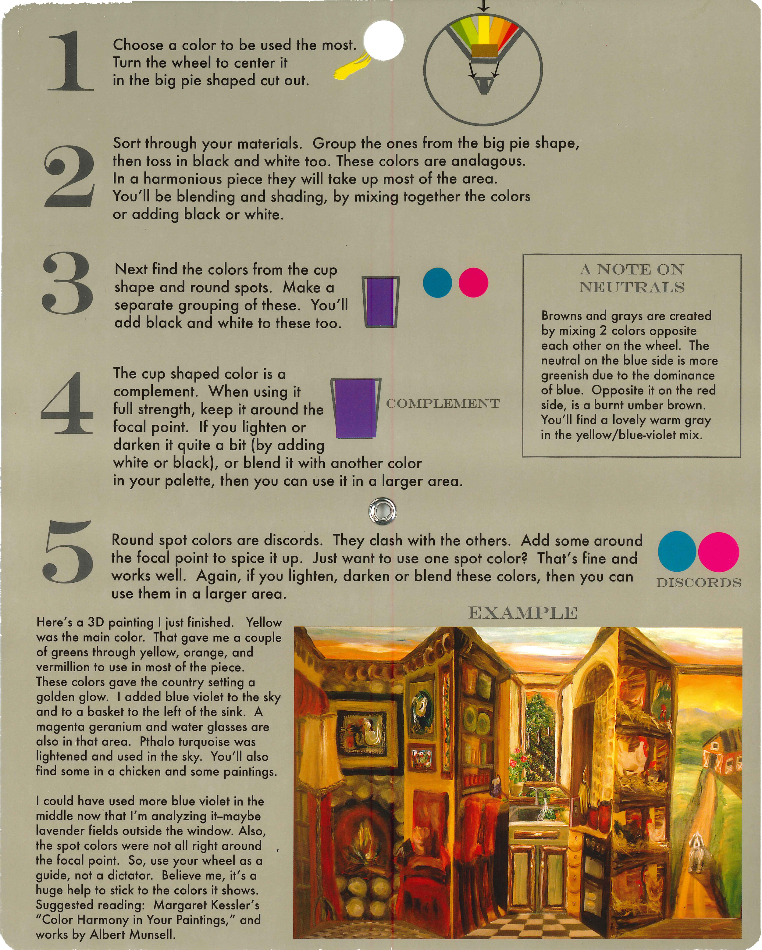
Artists who paint, quilt, do interior decorating, or other crafts will consider the Color Harmony Wheel by Mandarin Moose an especially useful tool.
Unlike a standard color wheel, the Color Harmony Wheel is based on the theory of five primary colors, rather than three, spaced evenly around the wheel. This allows the artist to discover slightly different, but better complimentary colors with the addition of purple and green to the original red, blue, and yellow.
Painters, you will notice the colors typed around the rim of the Color Harmony Wheel. Specific names are good to know for reference.
Interior Designers, you will want to take this guide with you when choosing wall color, fabrics, and flooring. See the browns and grays? Even these are specified for your ease of selection.
Quilters, as you hunt through your stash of fabrics, hold the Color Harmony Wheel up to them to get the right hues and neutrals for a lovely sewing project. Any fabric color which is not featured in the openings gets tossed aside! No arguments ;D
Feedback
“I especially like having the reminder of where the different paint colors - Prussian Blue, Cobalt Blue etc. - fall in relation to one another on the wheel. I cannot recommend this product enough.”
“The wheel is the only one of its kind I could find, excellent product and delivered promptly.”
“Finally, I’d been looking all over for a Munsell-type color wheel. This is it, very well executed. A huge help to my newest learning endeavor - painting. I would consider this a must have…”


